โ† All teardowns

Webflow landing page teardown
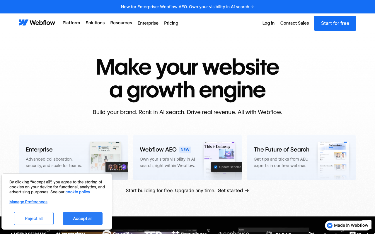
An AI conversion audit of https://webflow.com/ ยท scored 4.4/10 ยท engine: claude
Webflow landing page screenshot
4.4
Overall
4.0
First Impression
Weak
5.0
Conversion Power
Needs work
4.0
Content Quality
Weak
The Brutal Truth

This page reads like an internal roadmap slide, not a landing page: "Make your website a growth engine" is a vague, overused phrase that could apply to literally any SaaS tool, and the supporting line "Build your brand. Rank in AI search. Drive real revenue. All with Webflow." crams three unrelated value props into one breath without proving any of them. Below the fold you're immediately splitting attention across three competing cards (Enterprise, Webflow AEO, The Future of Search) before the visitor has even decided if this product is for them โ€” there's no single obvious next step, no visible proof (logos are cut off below the fold, no testimonial or metric near the hero), and the real primary CTA ("Start building for free. Upgrade any time. Get started โ†’") is buried in small text below three distracting cards instead of living prominently in the hero. A cookie consent modal is also physically overlapping the "Enterprise" trust content and testimonial avatar, actively blocking the reader on load.

Top 3 fixes

1
Headline is generic marketing-speak with no concrete outcome or audience signal.
Their copy

Make your website a growth engine

Rewrite

Launch a website that ranks, converts, and updates itself โ€” no developers required

Specific, benefit-led headlines that name the mechanism (rank/convert/update) and remove a pain point (no developers) convert better than abstract metaphors like 'growth engine'. ยท
How to fix: Replace the H1 text directly in the hero section component; keep font size/weight identical so layout doesn't break; verify against real customer language from support tickets or sales calls before finalizing.
2
Subhead lists three disconnected value props (brand, AI search, revenue) instead of one clear promise, diluting focus.
Their copy

Build your brand. Rank in AI search. Drive real revenue. All with Webflow.

Rewrite

Design and launch a site in days, and let Webflow's built-in AEO tools keep you visible as search moves to AI.

One coherent sentence with a clear primary benefit (speed to launch) plus a secondary differentiator (AEO) is easier to process than three disjointed fragments, improving comprehension and message retention. ยท
How to fix: Edit the subhead copy block beneath the H1; A/B test against current version using an on-page experiment tool (e.g., Webflow's own optimize feature) before rolling out globally.
3
Primary CTA is weak, small, and positioned after three distracting feature cards instead of directly under the hero copy.
Their copy

Start building for free. Upgrade any time. Get started โ†’

Rewrite

Get started free โ€” no credit card required

A short, high-contrast, benefit-clear CTA placed immediately under the headline reduces decision fatigue and removes purchase-anxiety objections (credit card) that block first click. ยท
How to fix: Move this CTA button to sit directly beneath the subhead, before the three cards; increase button size and contrast (solid blue background, white bold text); add 'no credit card required' as microcopy directly under the button.

Every conversion killer

Critical
Cookie consent banner overlaps and blocks hero trust content
The 'Accept all / Reject all' modal visually covers part of the Enterprise card and a testimonial avatar in the screenshot.
โ†’ Reposition the cookie banner to a slim bottom bar or corner toast that never overlaps content, and ensure it dismisses on scroll or first interaction.
Critical
No single, unmissable primary CTA above the fold
The hero shows only three navigational feature cards (Enterprise, Webflow AEO, The Future of Search) before the real CTA 'Get started โ†’' appears in small plain text further down.
โ†’ Add one large, high-contrast CTA button (e.g., 'Start building free') immediately under the subhead, above the three cards.
Major
Hero headline and subhead do not commit to one clear value proposition
"Make your website a growth engine" / "Build your brand. Rank in AI search. Drive real revenue. All with Webflow."
โ†’ Pick the single strongest differentiator (e.g., AEO/AI search visibility) and lead with it in both headline and subhead; move secondary benefits to supporting sections.
Major
No social proof or trust signal visible in the hero itself
Customer logos ('NCR Voxyix, monday, Spotify, TED, Dropbox, Greenhouse, CLEAR...') are cut off at the very bottom of the visible screenshot, not integrated into the hero.
โ†’ Pull 3-5 recognizable logos and a one-line customer quote with metric (e.g., '+40% organic traffic') directly into the hero, above the fold.
Major
Competing calls-to-action fragment attention immediately after headline
Three cards ('Enterprise', 'Webflow AEO NEW', 'The Future of Search') each with their own implicit link compete for the first click before any single primary CTA is presented.
โ†’ Demote these three cards to a secondary row below the primary CTA, or consolidate into a single 'Explore the platform' link.

Get this brutal audit for your page

Webflow scored 4.4/10. Find out what your landing page scores โ€” with exact copy rewrites and a step-by-step fix plan โ€” in about two minutes.

Analyze my website โ†’

Free diagnosis ยท full report $7, one-time