← All teardowns

Notion landing page teardown
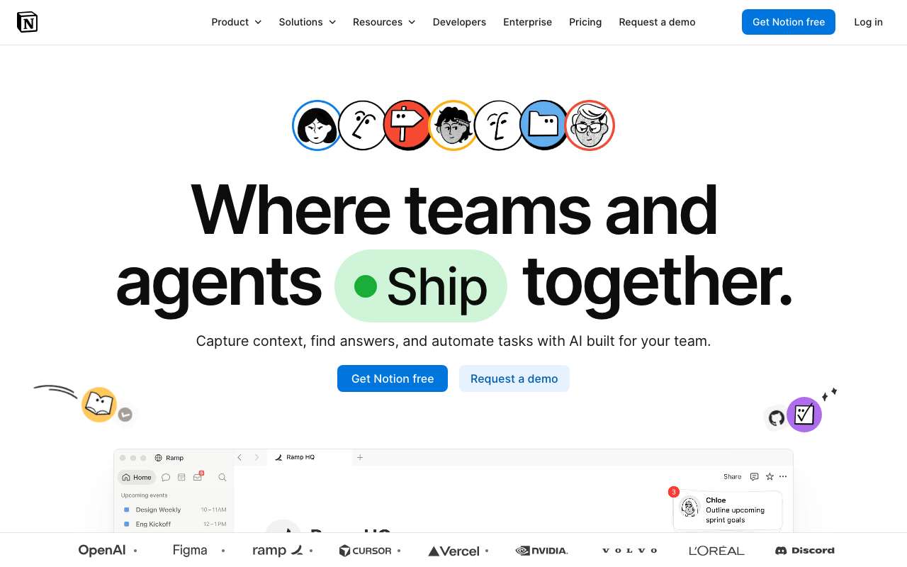
An AI conversion audit of https://notion.com/ · scored 5.0/10 · engine: claude
Notion landing page screenshot
5.0
Overall
6.0
First Impression
Needs work
5.0
Conversion Power
Needs work
4.0
Content Quality
Weak
The Brutal Truth

The hero leads with a cutesy wordmark pun ("Where teams and agents Ship together") that prioritizes cleverness over clarity — a first-time visitor has to work to figure out what Notion actually does or why "agents" matter to them, and the subhead "Capture context, find answers, and automate tasks with AI built for your team" is generic enough to describe a dozen competing AI tools; the logo strip (OpenAI, Figma, Ramp, Cursor, Vercel, Nvidia, Volvo, L'Oréal, Discord) is strong social proof but it's buried below the fold and undercut by having zero specific outcomes, numbers, or customer quotes anywhere near the hero, and the CTA pairing ("Get Notion free" / "Request a demo") forces enterprise-curious visitors and individual users into the same undifferentiated choice with no guidance on which path fits them.

Top 3 fixes

1
Headline is a pun-driven brand statement, not a clear value proposition — visitors don't learn what Notion does or why they'd use it in the first 3 seconds.
Their copy

Where teams and agents Ship together.

Rewrite

The AI workspace where your team and AI agents get work done, together.

A clear, benefit-forward headline reduces cognitive load and immediately signals both the product category (workspace) and the differentiator (AI agents working alongside humans), which matters more for conversion than a clever pun. ·
How to fix: Replace the hero <h1> text; keep the same visual weight/typography but drop the illustrated 'Ship' pill graphic or repurpose it as a small supporting icon rather than the load-bearing word in the sentence. A/B test against current version to confirm lift before full rollout.
2
Subhead is generic and feature-heavy without a concrete, differentiated outcome — 'capture context, find answers, automate tasks' could describe Slack, Glean, or any AI tool.
Their copy

Capture context, find answers, and automate tasks with AI built for your team.

Rewrite

Stop hunting across 10 apps for answers — Notion's AI finds it, writes it, and automates the busywork instantly.

Specificity ('10 apps', 'instantly') and a named pain point ('stop hunting') are more persuasive than abstract verbs; it also implies a before/after outcome instead of listing features. ·
How to fix: Edit the subhead copy directly under the H1; keep it to one sentence under 20 words; validate the '10 apps' claim against actual integration count before publishing, adjust number if needed.
3
Trust/social proof (customer logos) is strong but placed too low and with no context — no case study links, metrics, or quotes accompanying the logos to make the proof credible and specific.
Their copy

OpenAI · Figma · ramp · CURSOR · Vercel · NVIDIA · VOLVO · L'OREAL · Discord

Rewrite

Trusted by 100,000+ teams at OpenAI, Figma, Ramp, Vercel, and more — see how Cursor cut onboarding time by 40% with Notion.

Pairing recognizable logos with a quantified customer outcome converts passive brand recognition into active proof, and moving it closer to the fold increases the chance visitors actually see it before bouncing. ·
How to fix: Move the logo bar (or a condensed version of it) to appear directly below the hero CTA buttons, above the current fold line; add a one-line stat with a source link to a real case study; verify the customer count and stat with marketing/legal before publishing.

Every conversion killer

Critical
Vague, pun-based headline delays comprehension
Headline reads 'Where teams and agents Ship together.' with 'Ship' rendered as a stylized logo-like pill, making the sentence read more like a wordmark ad than a value statement.
→ Rewrite headline to explicitly state what Notion is and who it's for, e.g. 'The AI workspace where your team and AI agents get work done, together,' and remove ambiguity from the visual treatment of 'Ship'.
Major
No above-the-fold specificity or proof
Word count is only 555 across the whole page and trust_hits=2, social_hits=1 signal minimal concrete proof; hero contains no numbers, named customers, or outcomes, only abstract phrases like 'find answers' and 'automate tasks'.
→ Add a quantified proof point (customer count, time saved, or named case study) directly in or immediately below the hero subhead.
Major
Dual CTA with no differentiation confuses intent
Two equally-weighted CTAs 'Get Notion free' and 'Request a demo' sit side by side with no supporting microcopy explaining which is for individuals vs. teams/enterprise.
→ Add a short qualifier under or beside each CTA (e.g., 'For individuals & small teams' vs. 'For enterprise teams') so visitors self-select faster.
Major
Nav CTAs and dropdown menus have no verifiable destinations
CTAs like 'Product', 'Solutions', 'Resources', and 'Pause' all show href: '' with outcome 'no_effect_suspected' in the extracted signals.
→ Audit and confirm all top-nav dropdown triggers actually open functional menus or link somewhere; broken or dead nav elements erode trust before visitors even reach the offer.
Major
Logo-based social proof lacks context or specificity
Logo strip of OpenAI, Figma, ramp, CURSOR, Vercel, NVIDIA, VOLVO, L'OREAL, Discord appears with no accompanying stat, quote, or case-study link.
→ Add a one-line quantified claim (e.g., '100,000+ teams' or a specific customer result) next to or above the logo strip to convert passive recognition into active proof.

Get this brutal audit for your page

Notion scored 5.0/10. Find out what your landing page scores — with exact copy rewrites and a step-by-step fix plan — in about two minutes.

Analyze my website →

Free diagnosis · full report $7, one-time