Framer landing page teardown
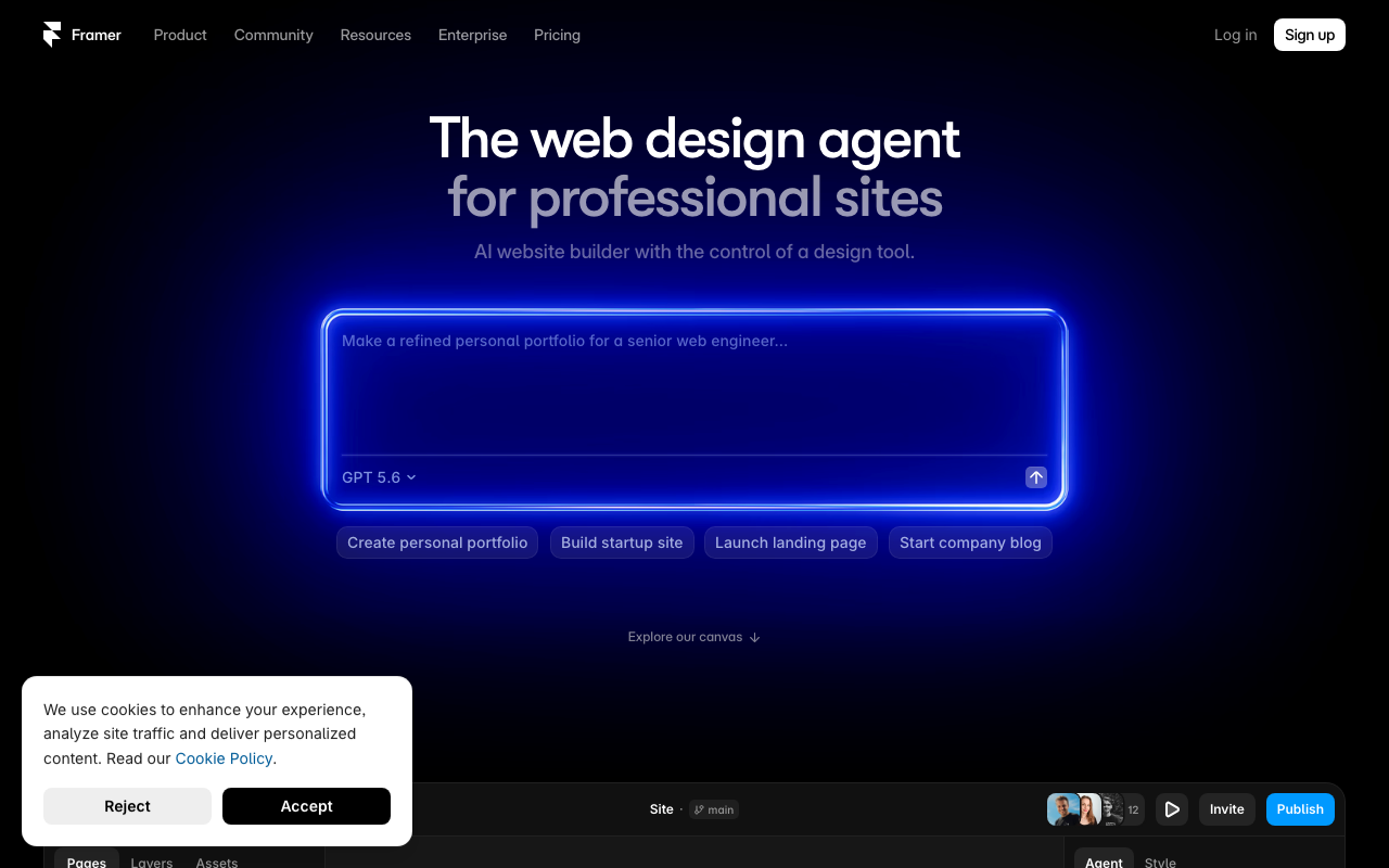
Framer's hero leans on a trendy but fuzzy phrase — "the web design agent for professional sites" — that sounds like a category tagline, not a value proposition; a first-time visitor has to do work to figure out this is an AI website builder that also gives you code-level control. The primary CTA is actually a giant prompt box, which is clever but risky: it's not a clear "Sign up" button, it's an open-ended text field with placeholder copy that assumes the visitor already knows what to type and why, and the real conversion action (Sign up) is small and tucked in the top-right nav instead of being reinforced near the hero interaction. A cookie consent banner is physically covering part of the page content on load, adding friction at the exact moment someone is deciding whether to engage. Trust and social proof exist ("Trusted by teams shipping big sites," a "Read story" link, a couple of avatars near the top toolbar) but they're thin, generic, and not paired with logos, numbers, or named customers, so they read as filler rather than proof. Overall the page is stylish and on-brand for a design tool, but it prioritizes vibe over clarity, credibility, and a low-friction path to action.
Top 3 fixes
The web design agent for professional sites
Build a professional website in minutes — with AI that writes the design, and full code control when you need it
Make a refined personal portfolio for a senior web engineer...
Describe the site you want to build — Framer's AI will design it for you. Try: "A portfolio for a senior web engineer"
Trusted by teams shipping big sites
Trusted by 50,000+ teams — including [Logo] [Logo] [Logo] — to ship production websites
Every conversion killer
Get this brutal audit for your page
Framer scored 4.8/10. Find out what your landing page scores — with exact copy rewrites and a step-by-step fix plan — in about two minutes.
Analyze my website →Free diagnosis · full report $7, one-time