← All teardowns

ClickUp landing page teardown
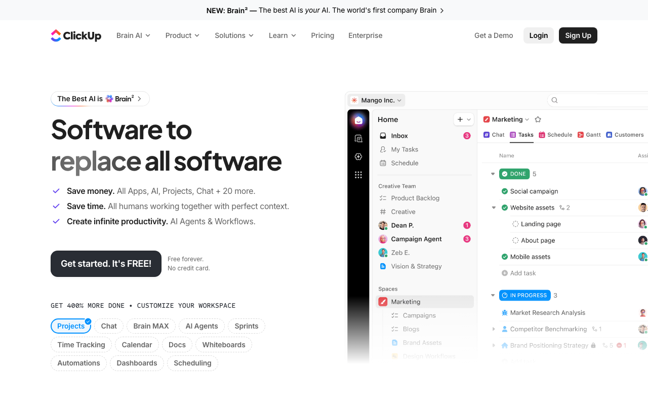
An AI conversion audit of https://clickup.com/ · scored 4.2/10 · engine: claude
ClickUp landing page screenshot
4.2
Overall
5.0
First Impression
Needs work
4.2
Conversion Power
Weak
3.5
Content Quality
Weak
The Brutal Truth

"Software to replace all software" is a punchy tagline but it's category-vague and doesn't tell a first-time visitor what ClickUp actually does, who it's for, or what problem it solves for them — a small business owner, a dev team, and a marketing team all read this and shrug. Below the fold you dump 20+ feature/app names (Projects, Chat, Brain MAX, AI Agents, Sprints, Time Tracking...) which reads as a self-centered feature dump rather than customer outcomes, there's zero social proof (no logos, no testimonials, no customer count) directly near the CTA to build trust, and the bullet copy ("Save money," "Save time," "Create infinite productivity") is generic marketing-speak with no specific numbers, timeframes, or proof points to back it up. The page is optimized for existing ClickUp fans who already know the product, not for cold traffic deciding whether to sign up.

Top 3 fixes

1
Headline is vague and doesn't state audience or concrete outcome, hurting immediate clarity for cold traffic.
Their copy

Software to replace all software

Rewrite

One app to run your whole team — projects, docs, chat, and AI, finally in one place

Cold visitors need to instantly understand what the product does and why it matters to them; a concrete outcome-based headline reduces bounce and clarifies fit within 3 seconds. · Hero section, main H1
How to fix: 1) Replace the H1 text in the hero component. 2) Keep the sub-line but pair it with a supporting line naming 1-2 target audiences (e.g., 'Built for teams of 2 to 2,000'). 3) A/B test against current headline for 2 weeks tracking signup rate.
2
Bullet copy is vague and unquantified, making bold claims without evidence, which reduces credibility for skeptical first-time visitors.
Their copy

Save money. All Apps, AI, Projects, Chat + 20 more.

Rewrite

Save money. Replace 5+ tools (Asana, Slack, Notion, Monday, Jira) and cut software spend by up to 40%.

Specific, named comparisons and quantified savings are far more persuasive than vague claims like 'save money' with no numbers attached. · Hero section, bulleted value props below H1
How to fix: 1) Pull real customer savings data or case study stats from marketing/sales team. 2) Update each of the 3 hero bullets with one concrete number or named comparison. 3) Link the bullet to a case study page for proof.
3
No social proof (logos, review scores, customer counts) exists near the primary CTA, leaving no trust signal at the critical decision point.
Their copy

Get started. It's FREE! / Free forever. No credit card.

Rewrite

Get started. It's FREE! / Free forever. No credit card. Trusted by 800,000+ teams including Netflix, Airbnb, and Booking.com.

Adding recognizable customer logos or a user count directly beside the CTA reduces perceived risk and lifts conversion, especially for visitors who've never heard of the brand. · Hero section, directly below CTA button
How to fix: 1) Get legal-approved list of 3-5 recognizable customer logos. 2) Add a thin logo strip or a one-line customer-count stat directly under/beside the CTA button. 3) Verify claim is current and cite source if needed.

Every conversion killer

CriticalHero
Vague, unquantified headline with no clear audience
"Software to replace all software" gives no indication of category, use case, or who it's for.
→ Rewrite headline to state a concrete outcome and imply target audience (e.g., 'One app to run your whole team').
CriticalHero / CTA area
No social proof visible above the fold
social_hits: 5 exist somewhere on page but none appear in the hero near the CTA; no logos, testimonials, or customer counts shown in the screenshot.
→ Add a customer logo strip or user-count stat immediately beside/under the primary CTA.
MajorHero feature pills
Feature-dump overload creates cognitive overwhelm
Row of 13 pill buttons: Projects, Chat, Brain MAX, AI Agents, Sprints, Time Tracking, Calendar, Docs, Whiteboards, Automations, Dashboards, Scheduling — all shown at once above the fold.
→ Reduce to top 3-4 flagship features above the fold; move the rest to a secondary section or 'See all features' link.
MajorAnnouncement bar / AI section
Self-centered, jargon-tinted messaging ('Brain²', 'Super Agents')
Nav banner: "NEW: Brain² — The best AI is your AI. The world's first company Brain" and heading "A new era of humans, with Super Agents".
→ Translate branded jargon into plain benefit language for first-time visitors (e.g., explain what 'Brain' does in one clear sentence before using the branded term).
MajorCTA buttons sitewide
CTA outcome unverified — no confirmation clicking leads anywhere clear
All CTAs (Sign Up, Get started. It's FREE!, Get a Demo) show outcome 'no_effect_suspected' with empty href in extracted signals.
→ Confirm CTA buttons route to functioning signup/demo forms; fix any broken or empty href attributes.

Get this brutal audit for your page

ClickUp scored 4.2/10. Find out what your landing page scores — with exact copy rewrites and a step-by-step fix plan — in about two minutes.

Analyze my website →

Free diagnosis · full report $7, one-time