← All teardowns

Calendly landing page teardown
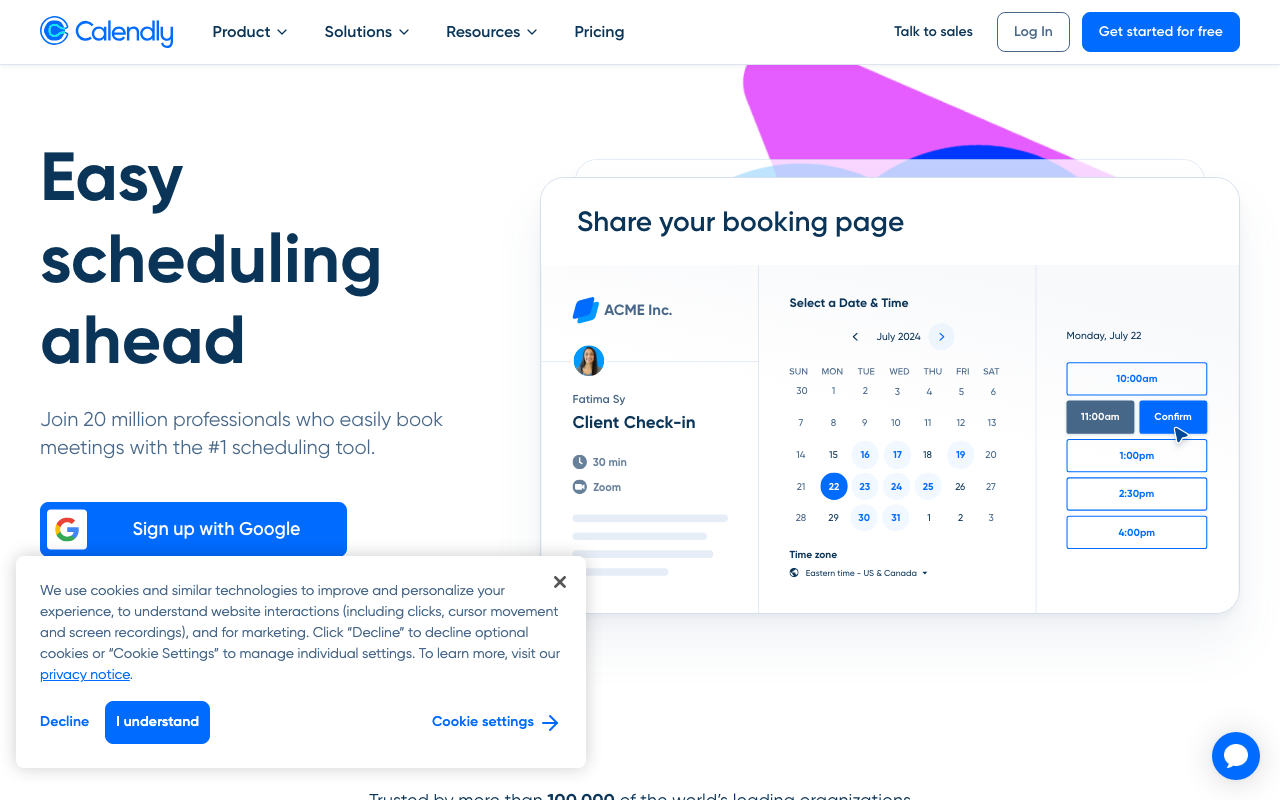
An AI conversion audit of https://calendly.com/ · scored 5.3/10 · engine: claude
Calendly landing page screenshot
5.3
Overall
6.0
First Impression
Needs work
5.0
Conversion Power
Needs work
5.0
Content Quality
Needs work
The Brutal Truth

This page is optimized for self-serve signup, not for a "book demo" goal — there's no visible "Talk to sales" or "Book a demo" CTA in the hero, the headline "Easy scheduling ahead" is generic fluff that could belong to a dozen SaaS tools, and the cookie banner is physically blocking the "Sign up with Google" button, killing the very CTA the page is pushing hardest; if the real conversion goal is demo bookings, this layout is actively working against it.

Top 3 fixes

1
Headline is vague and doesn't communicate a specific outcome or who it's for, and it doesn't connect to a demo/sales conversion goal at all.
Their copy

Easy scheduling ahead

Rewrite

See how 100,000+ teams cut scheduling emails to zero — book a live demo

· Hero section, top-left H1
How to fix: Replace the H1 text in the hero component. Keep font size/weight, swap copy, and add a secondary CTA button below it linking to the demo booking form (e.g., /demo).
2
Cookie consent banner overlaps and visually blocks the primary CTA ('Sign up with Google'), adding friction and hurting trust before a user can even act.
Their copy

We use cookies and similar technologies to improve and personalize your experience...

Rewrite

We use cookies to improve your experience. [Manage settings] [Accept]

· Bottom-left overlay, covering hero CTA area
How to fix: Move the cookie banner to a slim top or bottom bar (not overlapping hero CTAs) or reduce its height/z-index priority so it never covers interactive elements. Test on mobile and desktop viewports before shipping.
3
No demo-specific CTA exists above the fold — only self-serve signup and Google/Microsoft SSO buttons, which doesn't match the stated goal of driving demo bookings.
Their copy

Get started for free

Rewrite

Book a Demo

· Top nav bar and hero CTA row
How to fix: Add a second, visually distinct button (outline style) next to 'Get started for free' in the nav and hero labeled 'Book a Demo', linking directly to a scheduling/demo request page.

Every conversion killer

Criticalcp_friction
Cookie banner blocks primary CTA
The consent modal overlays directly on top of the 'Sign up with Google' button in the hero, making it unclickable until dismissed.
→ Reposition cookie banner to a non-blocking slim bar at the very bottom or top of viewport; ensure z-index and layout never overlap primary CTAs.
Criticalfi_above_fold_cta
No demo/sales CTA above the fold despite stated goal
CTAs list only includes 'Get started for free', 'Sign up with Google', 'Sign up with Microsoft' — no 'Book a demo' or 'Talk to sales' button appears until deep in nav ('Talk to sales' is small top-right text link, not a real CTA).
→ Add a prominent 'Book a Demo' button in the hero, styled equally or more prominently than the signup button.
Majorfi_headline_clarity
Vague, self-centered headline with no audience signal
Headline reads 'Easy scheduling ahead' — generic, no mention of who benefits (sales teams? recruiters? founders?) or what outcome they get.
→ Rewrite headline to name the audience and a measurable outcome, e.g. 'Book more meetings, faster — the scheduling tool 100,000+ sales teams trust.'
Majorcp_social_proof
Social proof is thin and unspecific
Subhead says 'Trusted by more than 100,000 of the world's leading organizations' but no logos, named customers, or specific results are shown in the hero.
→ Add 3-5 recognizable customer logos directly under the hero subhead, plus a specific stat (e.g., '30% fewer no-shows').
Majorcq_skimmable
Dense, feature-list-heavy body content
Headings list shows a long feature dump: 'Connect your calendars', 'Add your availability', 'Connect conferencing tools', 'Browser extensions', 'Automated workflows', 'Routing forms', 'Round robin & collective events', 'Admin management', 'Payment collection' — 2399 words total, no clear benefit-first framing.
→ Group features under 3-4 outcome-based headers (e.g., 'Never chase availability again') and cut word count by 40% for skimmability.

Get this brutal audit for your page

Calendly scored 5.3/10. Find out what your landing page scores — with exact copy rewrites and a step-by-step fix plan — in about two minutes.

Analyze my website →

Free diagnosis · full report $7, one-time